
Pedal Tracker
Bicycle Maintenance Tracker
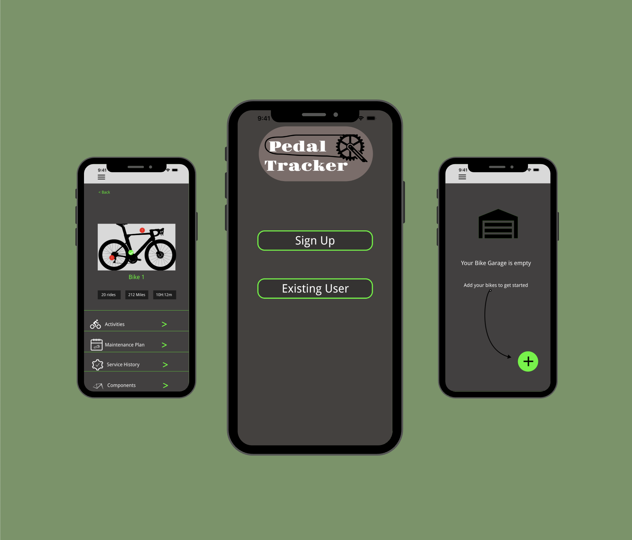
Pedal Tracker is a bicycle maintenance tracking app, that integrates seamless operation and priorities staying on top of the maintenance of your bicycle. With a user-friendly interface, it enables efficient bicycle maintenance tracking features including tracking bicycle mileage, adding separate components, and being able to view service history.
Project Overview
Roles
UX Designer
UI Interface
UX Research
Responsibilities
User Researching
User Surveys
User Interviews
User Research
Tools
Figma
Adobe Color
Photoshop
Google Forms
Duration
4 Weeks
Problem
In today’s fast-paced world, people face the challenge of balancing their daily lives while staying on top of everyday errands. One errand that bicycle owners need to perform is bicycle maintenance. However, keeping track of overall bicycle maintenance is hard, and is especially hard to track the required maintenance for individual components on the bike since they need to remember which part of the bike needs to be serviced and when. Existing tracking platforms often lack a user-friendly integration to manage their bicycle maintenance.
Audience
All cyclists, regardless of how often they ride their bikes and regardless of what reasons they ride
Solution
Having an account where all users’ bike profiles are saved.
Having a user-friendly way to add a bike to users’ accounts.
Having a way to add and view maintenance plans for each component on a user’s bike.

DISCOVERY
Research Methods
Competitive Analysis
User Surveys
Interviews
User Personas
Journey Map
Data: Main finding
Users want a way to view past maintenance (specifically by each bike component, when it was serviced, and what notes they added about each)
Process
Using the results from my research, I implemented what I learned about competing apps and about users’ wants and needs for a bike maintenance tracking app into the next phases of my design process
User Pain Points
Pain point 1: Users have to keep track of their own maintenance schedules, meaning they have to either use a physical or digital notebook that won’t send them reminders when maintenance needs to be done.
Pain point 2: Users can't add notes to their maintenance plan so they can’t look back at previous maintenance notes that are specific to each service performed.
Pain point 3: Without reminders, users won’t be able to plan required bike maintenance ahead of time so they won’t be able to plan their schedule around when maintenance is needed.
Competitive Analysis
To understand the problems that bicyclists are facing I started with a competitive analysis. I researched two competing bicycle maintenance tracking apps by doing a SWOT analysis to determine what I liked and didn’t like about the apps so that I could incorporate the findings into my design.
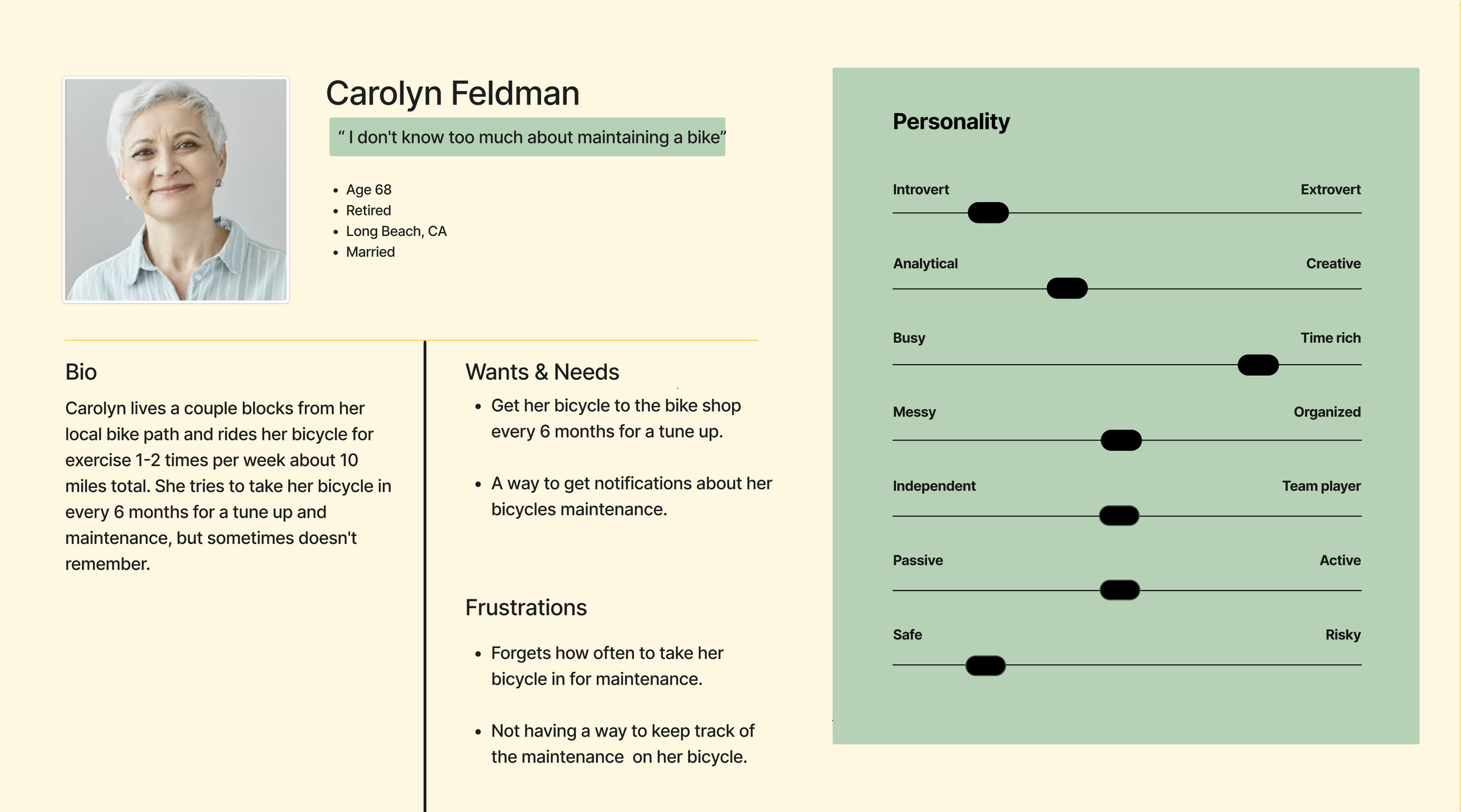
Persona
I created a user persona that captures the behaviors, goals, and needs of the participants. This consolidated representation provides a clear and concise understanding of the target users, guiding the development process effectively.
Journey Map
I created journey maps to better understand how cyclists track their bicycle maintenance and to identify the frustrations they feel about their current method of tracking maintenance. These journey maps also helped me determine what features to incorporate in my design that would solve their frustrations.
User Surveys
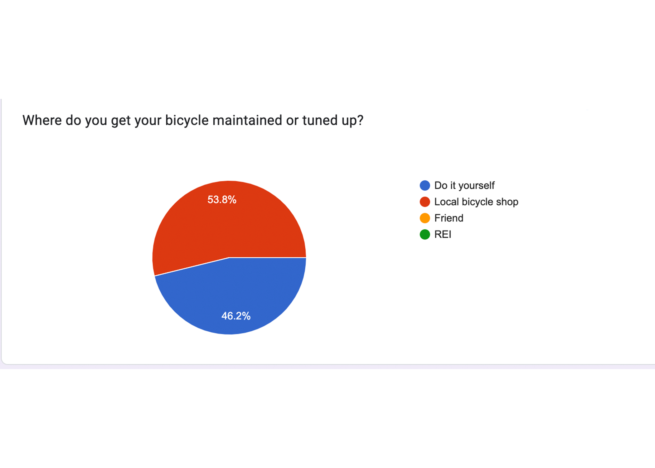
I conducted a user survey by preparing a series of questions on a digital form. My goal was to gain insight into how familiar people are with bicycle maintenance, which was important because this would help me determine the layout and features of my app and help me understand what users are looking for in an app that tracks bicycle maintenance.
User Research Results
User Interview
After user surveys, I conducted user interviews to get more detailed information about people’s experiences with bicycle maintenance. User interviews are an important part of the research because it allows me to empathize with users and get a better understanding of what I need to incorporate into my design based on the information that they share with me.

Define
User Stories
As a new user, I want to plan my bicycle maintenance ahead of time, so that I can plan my busy schedule.
As a new user, I want to be able to add notes to my bicycle components list, so that I can have details about what services were done.
As a new user, I want to be able to receive notifications about upcoming services for each bicycle component before they need to be serviced, so that my bicycle is always in good condition.
User Flow
I created user flows to visualize the paths users would take to complete the tasks in my user stories through my interface. This helped me understand the kind of visual hierarchy I would need to design and understand how all the elements would work together.
Site Map
I created a site map to map out various pages I wanted to include in my design, which allows me to visualize how individual pages are linked and prioritized.
Sketches
For my sketches, I experimented with product comparison layouts to get inspiration for my Crazy 8 Sketches, as well as become more familiar with apps that track maintenance. The purpose of using the Crazy 8 method for my sketches was to develop multiple iterations of the layout for the app, to consider different approaches, and to decide which layout is the most efficient in the context of the goal of this app.
Wireframes
I took inspiration from my sketches and all of my research and made digital wireframes. I started by creating low-fidelity wireframes, which aimed to solve the main problem cyclists were facing while tracking their bicycle maintenance.
The main problem is that it’s hard for cyclists to keep track of maintenance for their bicycles and for the individual components on the bike. For this wireframe, I focused on incorporating the user stories to include the features that these users want and need in a bicycle maintenance tracking app.
Logo & Branding
Clickable Low-Fidelity Prototype
Iterations
Pages need icons to make the app more user-friendly and to make the app more visually appealing
Add icons to the Bike Garage and Maintenance Plan page
Add icons to bike components
The “sign up” and “existing user” buttons were too small on the login page
Incorporate branding into the app
Add logo, colors, and fonts
Make the background dark
Usability Test
After incorporating updated iterations, I performed usability testing with multiple testers to find out about the user experience using my app, and to determine the functionality of the app. Usability testing also provided areas of improvement I needed to add to my high-fidelity prototype.
Usability Test Results
From the usability tests, users wanted to see the following changes:
Check boxes should be unchecked until the user selects the option
Done button at the bottom of the page instead of at the top
Confirmation page after adding a bike to the profile
Ability to add a picture of their bike when adding the bike to the account
Color to buttons that users select so they know the option was selected
Hi-Fidelity Prototype
Moving Forward
For designing the Pedal Tracker app, I incorporated everything I learned from my previous UX projects, which included conducting in-depth research to provide user-centered designs that solve a problem. Here, the problem I provided a solution for was that cyclists are facing difficulties with tracking their bicycle maintenance.
A mistake I aim to fix in my next project is testing my app with more people. Having a larger sample size would allow me to make efficient iterations to my design to continue to improve the app.
During this project, I learned the importance of good communication with user testers. By having clear communication with my testers, I can gain quality insight into the areas of my app that need improvement.


