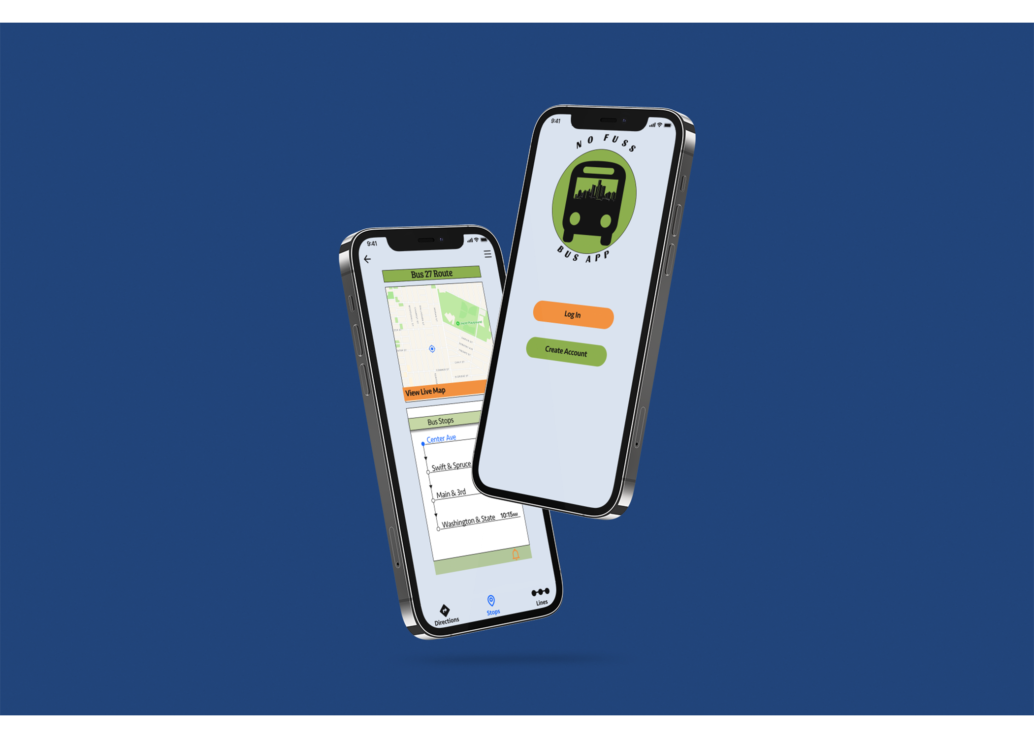
No Fuss Bus App
Bus Transportation App Product Design
Project Overview
This case study highlights the design and creation of a transportation app. The bus project seeks to address the issues bus riders have when trying to locate and differentiate their bus from other buses by specific time and location.
Roles
UX Designer
UI Interface
UX Research
Responsibilities
User Researching
User Surveys
User Interviews
User Research
Tools
Figma
Adobe Color
Photoshop
Google Forms
Duration
4 Weeks
Problem
The current problem bus riders are facing is that bus times aren't always accurate due to traffic, longer stops and bus maintenance. Because the city continues to add more bus routes and because many buses stop at the same stops, bus riders don't have a way to know when the next bus arrives and how much time they have to get to the stop. Bus riders would benefit from tracking how far away the bus is from each stop.
Client
A transportation agency for mid-size metropolitan areas in the Detroit, Michigan area.
Audience
Commuters in Detroit, Michigan.
Solution
The goal of this project was to create a mobile app that can be operated by the local city transit system that serves thousands of commuters. This app helps bus riders locate and identify their desired buses apart from other buses and allows bus riders to track when the next bus will arrive at each stop, which allows the bus riders to know how much time they have to get to the bus stop.
DISCOVERY
Research Methods
Competitive Analysis
User Surveys
Interviews
User Personas
Journey Map
Data: Main finding
Users want to be able to be alerted when their bus will arrive especially if the bus will be late, so that they can plan to arrive at the bus stop on time.
Process
Based on the findings from my research, I incorporated my results into my design process to develop a user-centered design.
User Pain Points
Pain point 1: 40% of bus riders experience difficulties with inaccurate information from their transit apps.
Pain point 2: 30% of bus riders experience that some transit apps are hard to use.
Competitive Analysis
I conducted this competitive analysis and researched two competing transit apps, called Moovit and Transit. For the Moovit app, I found their strengths were that it was very simple and easy to use, and had a notification center. Their weaknesses were that the maps were not detailed and app-users have to pay. For the Transit app, I thought their strengths were that their maps were more detailed and had more information. Their weaknesses were that the app was harder to use and it was only available in certain cities. I also found that with the Transit app, it only shows the name of the routes and not location.
Persona
Peter Thomas will be the one to represent the commuters who participated in my survey. The survey indicates that most participants are a student and have part-time jobs. I used Peter to communicate and summarize my user research.
Journey Map
I made a journey map to better understand how commuters locate their arriving bus, interact with the service, and identify opportunities for improvement. The map revealed frustrating commuting patterns and how I could add missing interaction points.
User Surveys
I used a user survey to screen participants and gather information. I think of "user-centered design" when I think of user surveys. This reminds me that I'm creating for people’s needs rather than for my own wants. It also allows me to use the human perspective to create solutions at all stages of the problem-solving process.
User Research Results
User Interview
My user interviews showed that buses are a viable transportation option for those who live in a city or town because there are a lot more buses in these areas. Interviewees shared with me that they would like to know when the bus they are taking will be arriving at their bus station through an app alert. This would help make their experiences less stressful.
Whether it's traffic, longer stops to assist passengers in wheelchairs, or taking the bus out of service for maintenance, riders have made it clear that the issues are that they don't know which bus is coming and how much time they have to get to the bus stop.
Define
User Stories
As a bus rider, I want to know when my bus is arriving at the Washington & State bus stop, so I can calculate how much time I have to reach the bus stop.
As a bus rider, I want to know when the next bus is arriving at the Washington & State bus stop so that I don’t rush to the bus stop if it is not my bus.
As a bus rider, I want the ability to view future arrival times for any of the seven bus lines (serving Washington & State), so that I know when my bus arrives.
User Flow
Site Map
This is a view of the app designed to show a hierarchy and provide site navigation.
Sketches
I started the design process with low-fidelity sketches which were influenced by my user flow and site map. This allows me to make faster decisions through visualization before moving on to the prototype. Each sketch addressed a problem that was mentioned and offered solutions. This was important because it allowed me to return to the sketches throughout the design process to ensure I didn't get off track.
Low-Fidelity Wireframes
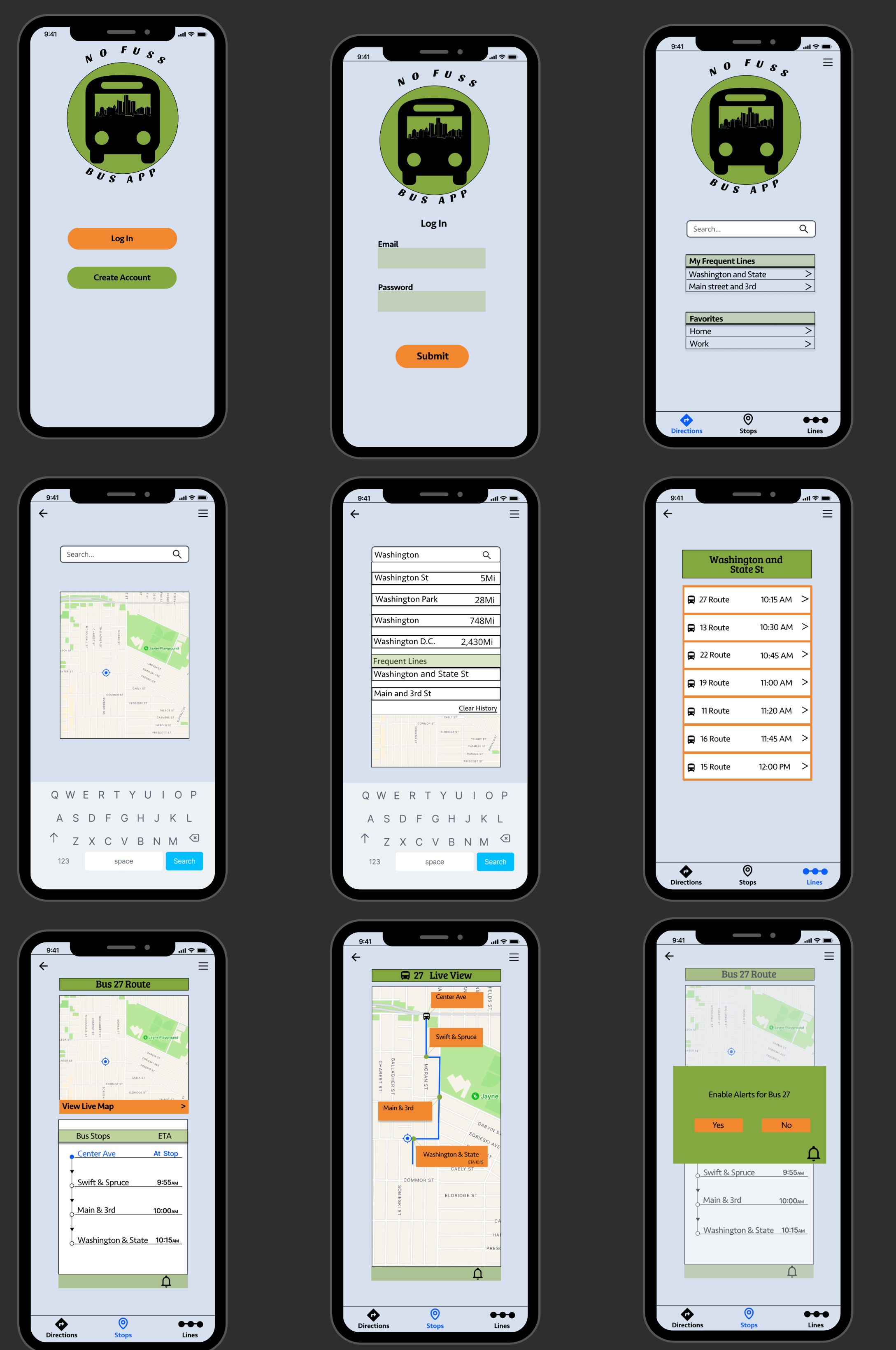
I used Figma to convert my sketches into wireframes. The wireframes showcase how the user will select one of the seven bus lines available, select their desired bus stop, and be provided an estimated time of arrival.
Logo & Branding
I first started by putting together a mood board. I took inspiration from the midwest city of Detroit, Michigan. In my mood board, there are a lot of pictures of the city skyline which is why I want to incorporate it in my logo. I really liked the colors of the Detroit Tigers baseball team, which their colors are blue and orange. I also wanted to use green and lighter shades of blue and green because it is the colors I found through user surveys that people think of when using travel apps.
Clickable Low-Fidelity Prototype
Iterations
Add color to distinguish between the “login” and “create account” button
Increase spacing between buttons for easy clickability
Add icons showing the user’s current location while searching for bus stops
Need an additional page showing all lines that stop at each bus stop
Add a live view to easily track the current location of the bus
The “clear” button on the search page should be changed to “clear history”
Usability Test
The primary purpose of the usability tests was to identify problems with the current design and find solutions before the product was finalized.
Results of Usability Test
The following summarizes the feedback received from the usability tests:
Make the logo larger
Change footer button icons to be more distinctive and larger
Make margins on the side of the pages smaller for better visibility
Widen all components on each page
Change Header 1 typography because it was too bold and hard to read
Use more Header 2 font sizes across all pages
Create more contrast between the alert page and the current page
Change the “return” button on the keyboard to “search”
Hi-Fidelity Prototype
Moving Forward
No Fuss Bus App is where I became a full-fledged Uxer through research, heavy ideation, and designing from user surveys, user interviews, and sketches to prototypes in Figma.
One mistake I made was that I should have done more usability tests with more users.
I learned the significance of human-centered design and how it can assist me in creating a better product or service that empathizes with users.


